
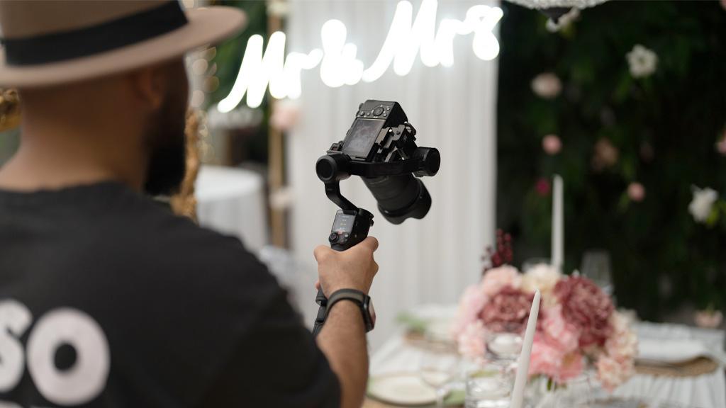
Every wedding photographer has that one reception story. The couple hung a glowing “Better Together” and “Mr & Mrs” sign behind their sweetheart table. Beautiful in person. On camera? A blown-out white streak floating above two underexposed silhouettes. The histogram looked like a mountain range, the LCD lied about how bad it was, and the bride’s mother stood three feet away watching with the kind of patience usually reserved for airport delays.
Neon signage is becoming increasingly popular at weddings, and the photography challenges keep coming with it. Couples order custom neon signs for everything from their last-name display to cheeky bar quotes, and as a photographer, you need a plan for shooting them effectively. The glow is part of the mood they paid for. Your job is to capture it without turning the sign into a white blob or losing the warmth of the moment around it.
This guide breaks down the camera settings, metering tricks, posing strategies, and editing techniques that keep neon signs looking vivid in wedding images. No overexposure. No guesswork. Just reliable methods you can pull out at any reception.
In This Article:
Why Neon Signs Are Challenging to Expose in Wedding Photography
Neon signs are concentrated light sources sitting inside dim environments. That contrast ratio is the core problem. Your camera’s sensor has to make a choice: expose for the bright sign or expose for the darker scene around it. It can’t do both equally well in a single metered reading.
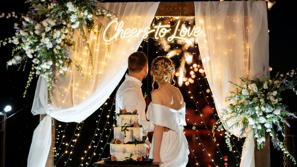
Wedding venues make this worse. Most receptions happen in spaces with mixed lighting: warm tungsten bulbs, string lights overhead, maybe candlelight on tables, and then a bright neon sign pumping out saturated color from one wall. Your camera’s auto mode will average all of that together and land somewhere in the middle, which usually means the neon is slightly blown and the ambient scene is slightly too bright. Not terrible, but not the kind of result you want to hand over in a gallery.
The other factor is color. Neon tubes (and their LED flex equivalents) emit narrow-spectrum light. A red neon sign doesn’t just look red; it’s aggressively red in a way that can clip the red channel in your histogram before the overall exposure looks problematic. You might not even notice it on your LCD during the reception. It shows up later in the post when you try to recover detail and find nothing there.
Understanding this dynamic matters more than memorizing settings. Once you internalize that neon is a point source fighting against ambient darkness, every decision that follows (metering mode, aperture choice, white balance) becomes a response to that same core tension.
Essential Camera Settings for Neon Sign Wedding Photography
Start in manual mode. Aperture priority and shutter priority both struggle with the exposure swings neon creates, so take full control and adjust as you move around the sign.
Aperture: f/2.8 to f/4. This range keeps your depth of field shallow enough to separate the couple from the background while still holding the neon lettering in reasonable focus. If you go wider (f/1.4 or f/1.8), the sign itself can fall partially out of focus depending on your distance, and individual letters start to blur into each other. That might be intentional for an artistic shot, but for your bread-and-butter couple portrait next to the sign, f/2.8 is the sweet spot.
Shutter speed: 1/125 to 1/200. Fast enough to freeze movement (couples shift, laugh, lean in) but not so fast that you kill all the ambient light. If you’re on a tripod for detailed shots of the sign alone, you can slow down to 1/60 or even 1/30. But for portraits, stay above 1/125.
ISO: 800 to 3200. Wedding receptions are low-light environments, and you need sensitivity. Modern full-frame bodies from Sony, Canon, and Nikon handle ISO 3200 with minimal noise. If you’re shooting a crop sensor, try to stay at 1600 or below and compensate with a wider aperture or slower shutter speed.
One more thing worth stressing: shoot RAW. Always. JPEG compression is especially unkind to neon colors because the algorithm throws away subtle color data you’ll want during editing. RAW files give you the latitude to pull back highlights on the sign without destroying the surrounding tones.
How to Meter Exposure for Neon Signs in Low-Light Wedding Venues
Switch to spot metering. This is non-negotiable for neon work. Evaluative (or matrix) metering reads the whole frame and tries to average everything out, which is exactly the behavior that causes overexposure on the sign. Spot metering reads only a small area, usually 1-5% of the frame, tied to your focus point.
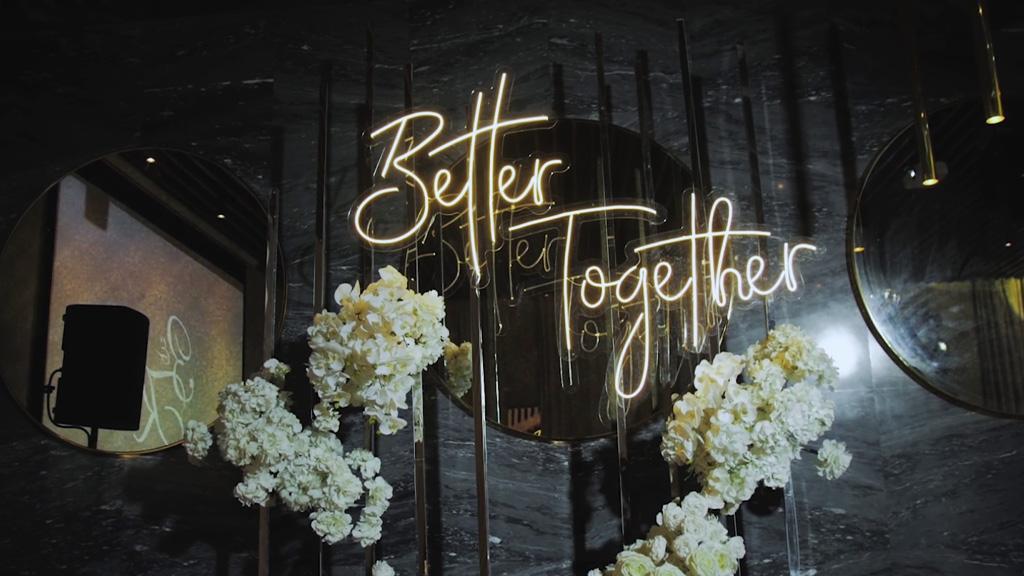
The workflow is straightforward: point your spot meter at the brightest part of the neon sign and take a reading. Then open up your exposure by about 1 to 1.5 stops from that reading. This keeps the sign bright and vivid without clipping the highlights. The ambient scene will naturally fall darker, which is fine. Receptions are supposed to look moody and warm, not lit like a grocery store.
If your camera supports it, turn on highlight-priority metering or enable “blinkies” (highlight alert) on your LCD playback. Those flashing patches on your screen show you exactly where highlights are clipping. Glance at your playback between shots, and if the neon text itself is blinking, dial back your exposure by a third of a stop until it stops.
For photographers who use a handheld light meter (and some wedding shooters still do), take an incident reading at the couple’s position and a reflected reading off the sign. Split the difference, then bracket a few frames. You’ll have options in post.
How to Set White Balance for Accurate Neon Sign Colors in Wedding Photos
Auto white balance is usually wrong for neon. Your camera will try to neutralize the strong color cast from the sign, which shifts the surrounding scene into unnatural tones. A warm red neon sign might push your auto WB to overcorrect, making skin tones look bluish and unflattering.
Set a manual white balance between 3200K and 4000K for most indoor wedding venues with warm lighting. This temperature keeps skin tones natural while maintaining the neon color’s saturation and accuracy. If the venue uses cool LED overhead lighting, bump it up toward 4500K.
A trick worth borrowing from live music photography (where neon and colored lighting are constant): set your white balance for the ambient light, not the sign. The neon is supposed to look colorful and intense. That’s the point. If you white-balance for the sign, everything else in the frame looks off. Balance for the room, let the neon pop, and your photos will feel like they match what guests actually experienced.
Shooting RAW gives you freedom to fine-tune white balance in Lightroom later, but getting close in-camera means less editing time. And when you’re delivering 500+ images from a wedding, every saved minute of editing counts.
Best Couple Poses and Positioning Near Neon Signs for Wedding Photos
The sign should light the couple, not compete with them. Position the pair 3 to 5 feet in front of the sign, angled slightly so the neon casts a colored rim light along one side of their face and shoulders. This distance keeps the sign readable in the background while using its glow as practical fill light on the subjects.
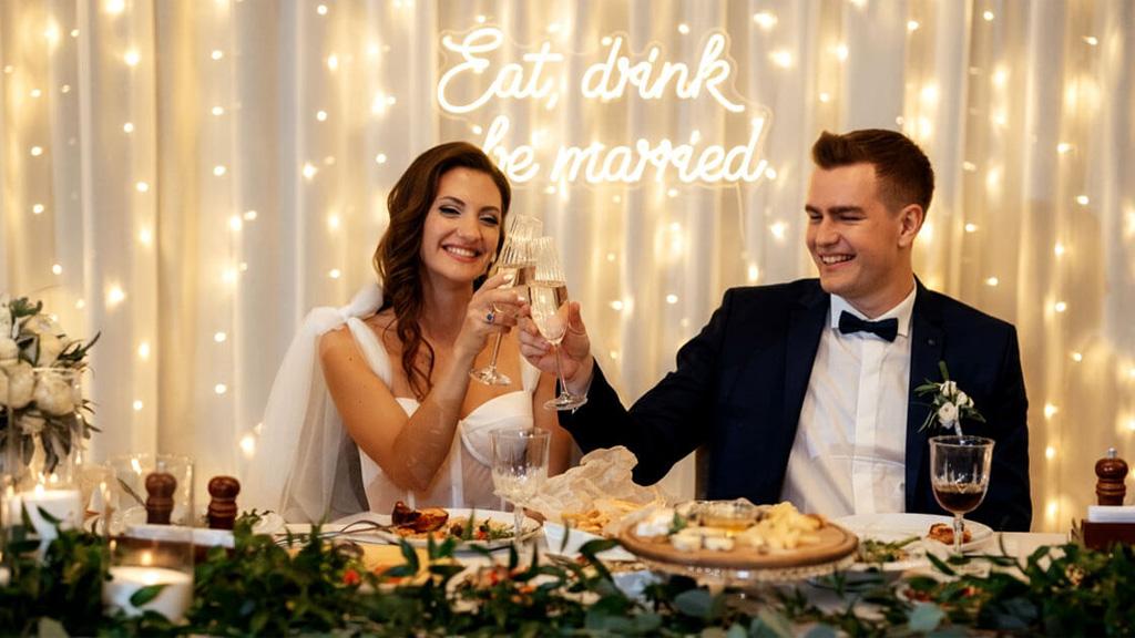
If you place the couple directly in front of the sign, two problems appear. First, their bodies block the text. Second, the sign becomes a bright halo behind their heads, which either blows out or creates distracting lens flare. Offset them to one side, with the sign occupying the opposite third of the frame.
For pose direction, keep it natural. Foreheads together, with eyes closed, works well because the couple relaxes, and the neon bathes the scene in color without anyone squinting into the light.
Walking toward the camera while holding hands, with the sign behind them, gives you both motion and context in a single frame. A quiet moment where one partner whispers something and the other laughs reads as candid, even if you directed it, and the neon sells the atmosphere.
Watch for reflective surfaces near the sign. Glass tabletops, mirrored walls, and glossy floors can bounce neon color into unexpected places. Sometimes that’s gorgeous (a pink glow on a marble floor). Sometimes it’s a distraction. Move your angle to control it.
How to Create Beautiful Neon Bokeh in Wedding Reception Photography
Bokeh from neon signs is one of the best visual gifts a reception can offer. Those soft, colored orbs floating in the background turn an ordinary couple portrait into something that looks editorially styled. Getting it right takes a specific technique.
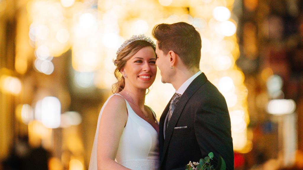
Open your aperture to f/1.8 or f/1.4 and increase the distance between your subjects and the sign. Bokeh quality depends on that distance ratio: the farther the sign is behind the couple relative to your focus distance, the larger and softer those out-of-focus circles become.
A couple standing 4 feet from you with the sign 15 feet behind them will produce much better bokeh than a couple standing right next to the sign.
Lens choice matters here. An 85mm f/1.4 is the gold standard for neon bokeh at weddings. The longer focal length compresses the background and renders out-of-focus highlights as smooth, circular rather than the cat-eye shapes you get from some wide-angle lenses. A 50mm f/1.4 works too, especially in tighter spaces, but the bokeh circles will be smaller.
One creative approach: shoot through something. Hold a prism, a piece of glass, or even a strand of fairy lights near the front of your lens to add foreground bokeh that mirrors the neon tones behind the couple. It’s a simple trick that adds depth to the image without any post-processing.
Common Neon Wedding Photography Mistakes (and How to Fix Them)
Trusting the LCD at the reception. Your camera’s rear screen is brighter than a calibrated monitor, and in a dark venue, everything looks properly exposed on that little screen. Check your histogram instead. If the right edge shows a spike that’s climbing the wall, you’re clipping highlights on the sign.
Using a flashlight pointed at the sign. On-camera flash aimed at a neon sign washes out the glow entirely. The sign goes from warm, atmospheric color to flat, lifeless plastic in one pop. If you need to fill light on the couple, bounce your flash off a wall or ceiling behind you, or use an off-camera speedlight positioned to light the couple from the side without hitting the sign directly.
Ignoring the sign’s flicker. Both traditional gas neon and LED flex signs can flicker at frequencies that create banding or uneven exposure, especially at faster shutter speeds. Gas neon on AC power flickers at double the mains frequency (100Hz or 120Hz), while LED signs can pulse at several hundred cycles per second, depending on their driver.
If you notice an inconsistency between frames, slow your shutter to 1/60 or below for a few test shots. Shoot a quick burst when you arrive at the reception and check for banding before the real portraits start.
Over-editing in post. It’s tempting to crank the vibrance slider when you see neon colors in Lightroom. Don’t. Over-saturated neon looks cheap and fake in prints. The sign already provides strong color. Your job in the post is to preserve it, not amplify it.
How to Edit Neon Wedding Photos in Lightroom Without Losing the Glow
Start with the highlights slider. Pull it down to -40 or -50 to recover detail in the neon sign itself. Then bump the shadows slider up slightly (+20 to +30) to lift the darker areas around the couple without flattening the overall mood.
The HSL panel is where neon photos really come together. Go to the luminance tab and reduce the brightness of whatever color your neon sign is. If it’s a pink sign, bring the magenta and red luminance channels down by 15-25 points. This darkens the sign’s color without desaturating it, keeping the glow rich and controlled rather than blown out.
Use a radial filter or brush to create a local adjustment over just the sign area. Drop the highlights and increase the clarity slightly (+10 to +15) within that selection. This brings back the text’s crispness and definition without affecting the rest of the image.
For color grading, resist the urge to shift the neon’s hue. If the couple ordered a warm white sign, don’t make it cool blue in post because you think it looks trendier. The sign color is an intentional design choice they made for their wedding. Respect it. Adjust the midtone and shadow color grades independently to complement the neon, but leave the sign’s actual color alone.
One last tip: export at full resolution with minimal sharpening for social media delivery. Over-sharpened neon text develops visible halos around the letters, and those artifacts look especially obvious on phone screens where most couples will view their gallery first.
Neon Sign Wedding Photography: What to Remember Before the Shoot
Ask the couple about their sign before the wedding day. Find out the color, the size, where it’s being mounted, and whether it’s plugged in or battery-powered (battery packs can die mid-reception, and you don’t want to discover that after you’ve built your shot list around it). Visit the venue during setup or ask the planner for a photo of the sign in place so you can plan your angles.
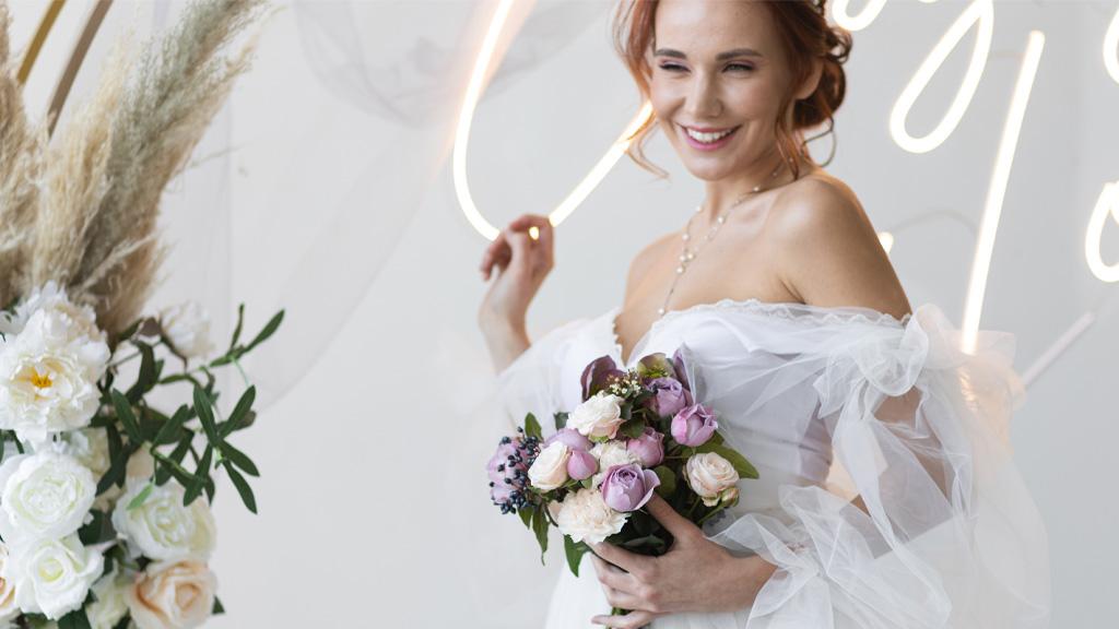
Bring a step stool or a small ladder. Neon signs are often hung at eye level or slightly above, and shooting from a lower angle with the sign behind and above the couple creates a natural framing effect. A few inches of extra height on your end can mean the difference between the sign floating behind their heads and the sign sitting awkwardly at their waist level in the frame.
Build a mini shot list specific to the sign: one wide establishing shot showing the sign in context with the venue, one medium portrait of the couple, one close-up detail shot of the sign alone, and one creative bokeh shot from across the room. Four frames, five minutes, and you’ve covered every angle the couple and the venue coordinator will want to see.
Neon signage is one of those reception details that photographs beautifully when you prepare for it and terribly when you wing it. The couples investing in these pieces are working with LED neon sign makers to create something personal for their celebration. As photographers, we owe it to them (and to our own portfolios) to capture that investment as well as it deserves.
A little preparation on metering, white balance, and positioning goes a long way, and the results are the kind of images that get shared, printed, and remembered.